This article is the third part of the series. The first article covered the conversation layer, the second covered the development cycle that turns the brief into live changes, and this final part covers the image workflow. In other words: after the talking and the pushing, here comes the picture-making.
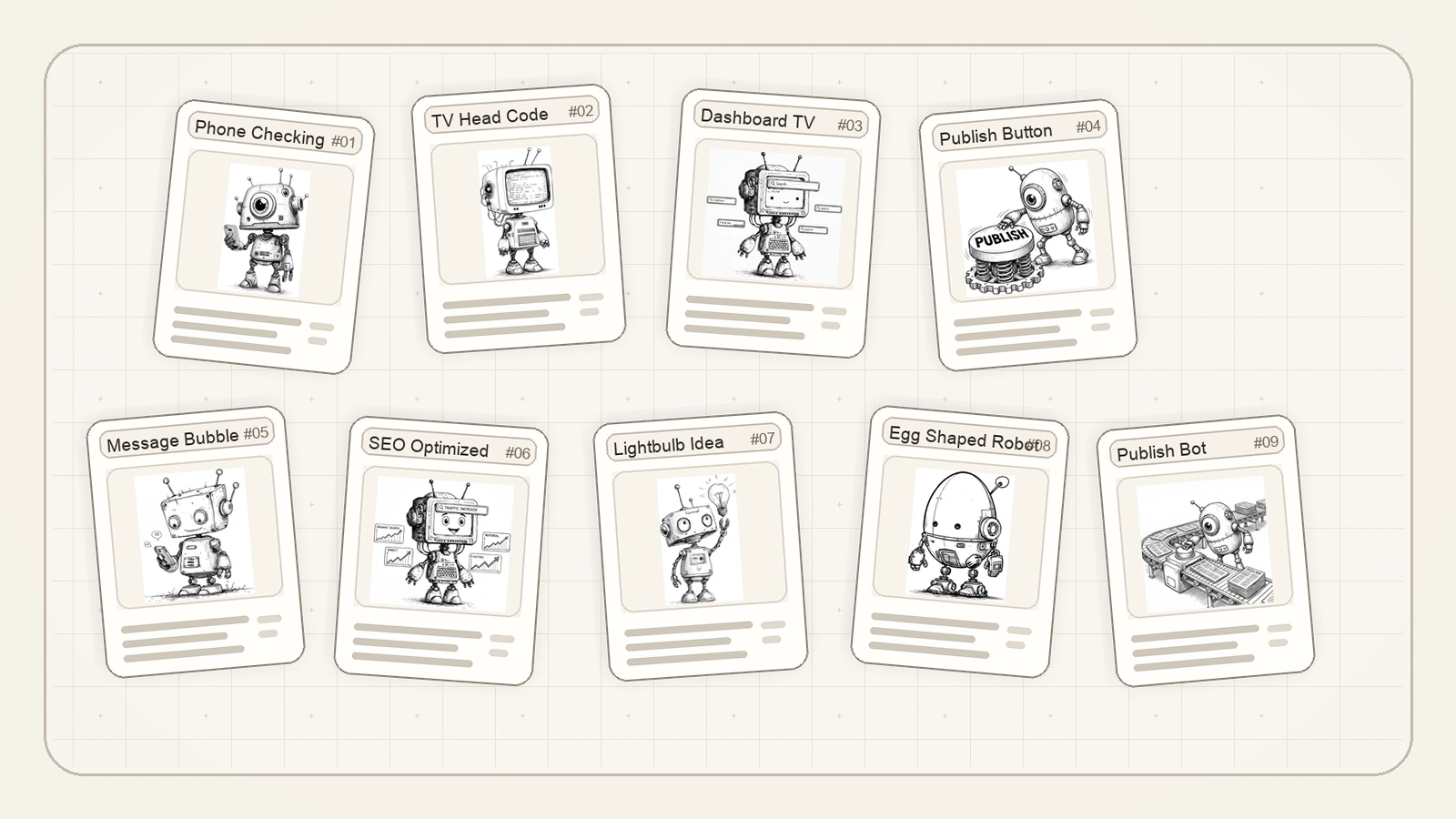
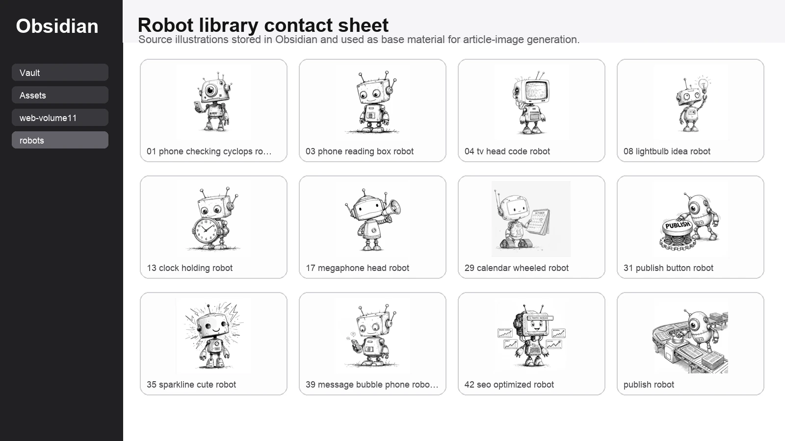
The short version is that the image workflow was not random at all. Hermy went into my Obsidian library, looked through a bank of robot illustrations, picked one that matched the publishing theme, turned that into a promptable source image, optimised the final asset, and then folded it back into the live article pipeline.
Part 3 of 3 in the Bloomindesign Hermy workflow series. Start with Part 1: the conversation workflow, continue with Part 2: the development cycle, and you are currently reading the image workflow finale.
Start with the source library, not a blank prompt box
The first useful thing here is that I was not asking Hermy to hallucinate a visual language from scratch. I already had a robot library in Obsidian. That meant the process began with existing style references rather than with the usual thrilling game of hoping the model guesses what I meant.
I asked Hermy to inspect the robot library and find a source image that fit the article. For the body of the workflow article, that mattered because I wanted the banner to feel like a helpful publishing assistant rather than a generic sci-fi mascot.
Why this specific robot was chosen
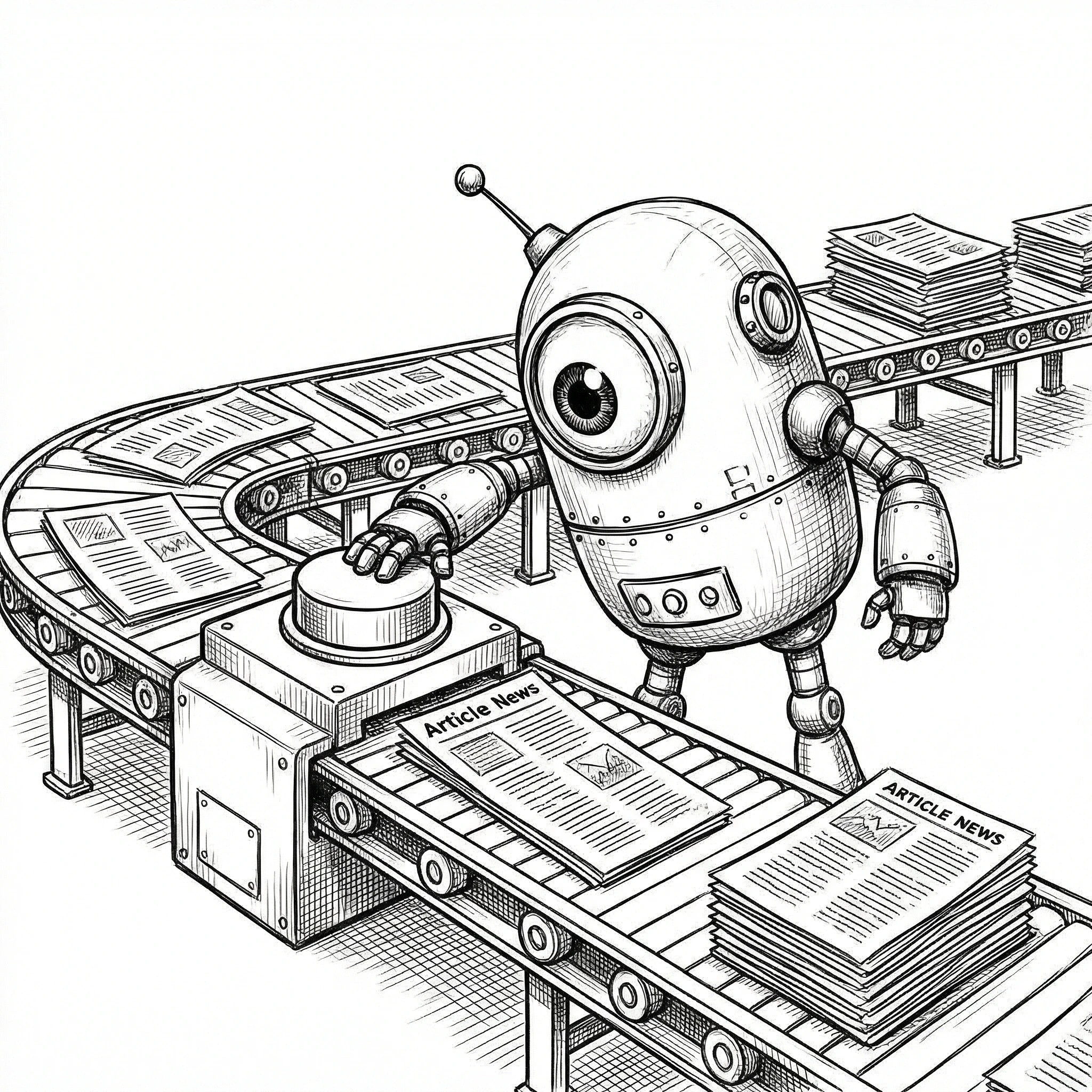
From the library, Hermy selected the publish-robot illustration as the base image. That was the right call, because it already contained the exact metaphor the article needed: a robot, article pages, and a publishing mechanism. No need to overcomplicate it when the source image is already basically shouting the theme at you.
This was much better than picking a random cute robot and trying to force the publishing idea into the prompt afterward. The source image already had editorial energy, so the prompt could focus on composition and transformation instead of doing all the heavy lifting alone.
What Hermy was trying to generate
The prompt
Once the right source image had been chosen, the next job was prompt design. The working prompt was essentially this:
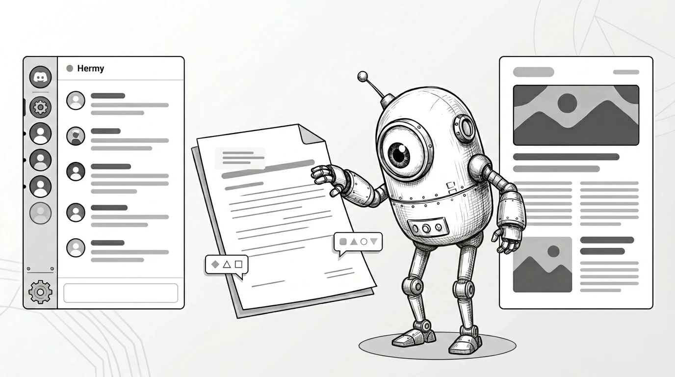
Using the attached sketch-style publish robot illustration as the base image, create a refined 16:9 monochrome editorial hero banner for a blog article about using Hermy in Discord to discuss, draft, review, and publish blog posts. Keep the source robot recognizable and friendly. Simplify the composition and increase the Discord presence slightly. Use four major elements: a larger Discord-like chat panel on the left, one clean draft/review document in the middle, the robot near center-right, and one polished published article page on the far right. Use only abstract interface lines and shapes, not readable placeholder words. No gibberish text. Leave generous negative space for editorial headlines. Elegant, airy, distinctive, mainly black, white, and grey, with no clutter, no bright colours, and no stock-SaaS look.I then regenerated the banner as a cleaner black-and-white and grey-tone hero image with stronger Discord cues and abstract interface treatment instead of placeholder copy. That is now the default direction for article banners unless colour is genuinely doing an important job, because the line-art source material already has enough personality without turning every banner into a neon fruit machine.
Why Nano-banana-2 was the right model for this
Nano-banana-2 was a good fit here because the job was not ultra-literal product rendering. It was stylistic transformation. I wanted the output to stay playful, illustration-led, and visually opinionated while still becoming cleaner and more banner-ready.
That is exactly the kind of thing this model is useful for: taking a strong character source, preserving the vibe, and pushing it into a more finished composition without sanding off all the charm in the process.
Step 1: What the finished banner needed to do
The final image was not there just to look nice. It had a job to do. It needed to make the article topic obvious before a single paragraph had been read: Discord conversation on the left, drafting flow in the middle, publish moment on the right, and a robot assistant tying the whole thing together.
Step 2: Why this workflow is better than starting from nothing
The biggest win here is not merely that an image got made. It is that the image came from a reusable system. Obsidian held the source library. Hermy searched it. A suitable source image was chosen for the article. The prompt was shaped around that source. Then Nano-banana-2 handled the visual transformation.
That is much better than beginning every asset request from scratch with “please make me a robot banner” and then acting surprised when the result looks like three unrelated ideas got trapped in a blender.
Step 3: What I would improve next
The next iteration is obvious. I want the image workflow to become even more documented and repeatable: stronger prompt templates, cleaner source-selection notes, more explicit before-and-after comparisons, and a default monochrome treatment for article banners unless colour is genuinely helping the concept.
I also want Hermy to produce a more literal Obsidian screengrab when needed, rather than a neat contact-sheet substitute, because sometimes showing the real source environment is better than politely tidying reality for presentation.
Read the full series
Three articles, one system: conversation, development cycle, then image workflow.
The actual pattern worth keeping
The useful pattern is simple: keep a proper source library, let Hermy inspect it, choose the base image with intent, write prompts around the selected source rather than around vague vibes, and use the image model to transform rather than invent the entire visual language from thin air.
That way the images feel connected to the wider Bloomindesign world instead of looking like random visitors from a completely different universe. Which, call me fussy, is usually preferable.